2.8 13/13

You don’t have to have the final solution, and that shouldn’t stop you from accumulating inspiration or ways of seeing. — Vaughan Oliver
Liminality
13/13 is an experimental approach in which a designer conceptualizes and visualizes a 13th month. The 13th month is an abstract notion of time and space outside our standard culture or society. Cultural anthropologist Victor Turner describes the study of a modality of social interrelatedness, which he calls communitas; communitas is a Latin noun commonly referring to an unstructured community in which people are equal. 13/13 reflects the space and spirit of communitas.
Turner outlines three groups that are endowed with the belief of a non-social-structure. They are described as liminality, outsiderhood, and structural inferiority. The 13th month particularly illuminates liminality between calendar months. 13/13 is in-between time and space or as Turner describes it, “…being in a tunnel in transition”. Turner states “…the liminar becomes ambiguous, neither here nor there, betwixt and between all fixed points of classification.”

James Grady (left) Camila Afanador (center) Milan Nedved (right)
Unstructured Collaboration
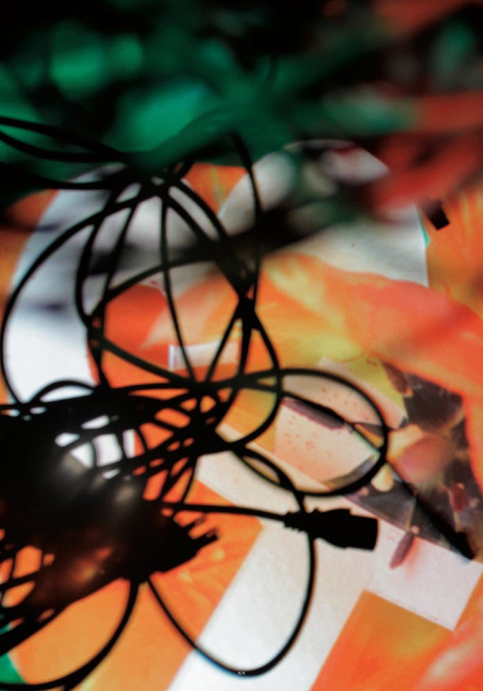
This project was developed in collaboration with fellow classmates Camila Afanador and Milan Nedved. 13/13 was created during a weekend design charrette hosted by graphic designer Vaughan Oliver. Having only forty-eight hours from start to finish on this project, students needed to work quickly. The first day started at the hardware store; we bought as many 1’s and 3’s as we could find-brass and silver house numbers, reflective stickers for mailboxes, and cardboard number stencils, to name a few. With a 50mm macro lens we started to experiment by photographing these objects in a variety of exterior environments. Many beautiful images emerged from this process, but it wasn’t until we went back to Milan’s house for dinner that we started looking at the images through a digital projection on the wall. Immediately we started moving the projector towards different surfaces within the house. We then started capturing macro images of the different projections of the original images. After shooting 1300+ images over the two days, we selected and created thirteen (28" x 40") single image posters that hung in the center of a large studio space. The gaps between the posters reinforced the liminal spaces and sense of communitas, inviting us to experience a threshold space. We also produced a 400-page book with a portion of the images captured that weekend.
Originally published at http://jamesjgrady.com on June 13, 2012.
